

In this blog , we will be building a Python Project (Sales Dashboard) with the help of Streamlit library , We will turn data of an excel sheet into an interactive Sales dashboard with sliders , and dropdowns and many more features. All you have to do is to understand what happens behind each and every code.
Prerequisites :
You must Know Python and should have a fair idea about data analysis.
Building Your First Web App
Before we dive in our Python Project , you must know how streamlit works. Follow these instruction to begin your project.
First Step – Installing Streamlit
Streamlit is an open-source Python library that makes it easy to create and share beautiful, custom web apps for machine learning and data science. In just a few minutes you can build and deploy powerful data apps. So let’s get started!
To start with this python project, you just need to install streamlit. Installing streamlit is easy. Follow these Steps :
Go to Terminal and type the following code :
pip install streamlit
Second step : Checking Streamlit and Building Your First Web App
Now that you have installed streamlit. It’s time to check if it’s running properly.
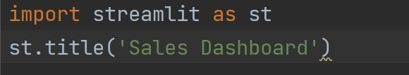
Import Streamlit :
import streamlit as st
Add title of your web application:
st.title('Sales Dashboard')
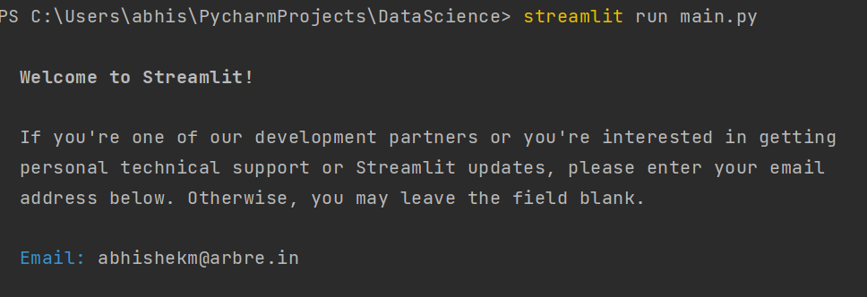
Run the Program :
Go to terminal of your application and type this code :
streamlit run filename.py
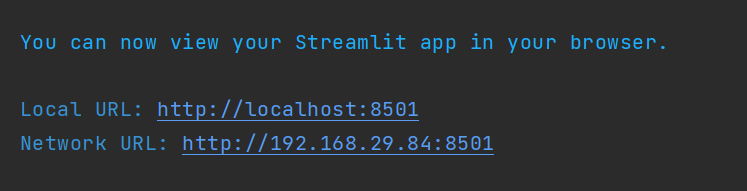
Though Your Web application will be opened automatically, but you can also click on these URL to open your first Web Application.
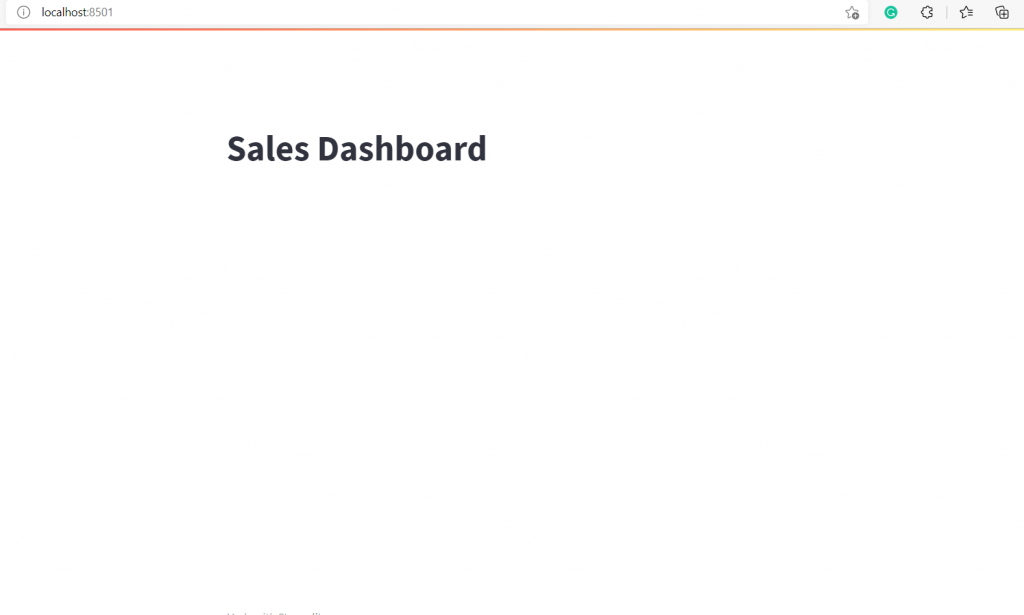
If You have done everything right , Your Web application would look something like this.
Project Information : Sales Dashboard
We will be creating a sales dashboard with the help of streamlit and plotly. Before we start coding ,install two more libraries.
Download and copy the excel file from where you will be fetching data :
pip install plotly
pip install openpyxl
Here is the code for the Sales Dashboard Project:
import pandas as pd  # pip install pandas openpyxl
import plotly.express as px  # pip install plotly-express
import streamlit as st  # pip install streamlit
# emojis: https://www.webfx.com/tools/emoji-cheat-sheet/
st.set_page_config(page_title="Sales Dashboard", page_icon=":bar_chart:", layout="wide")
# ---- READ EXCEL ----
@st.cache
def get_data_from_excel():
    df = pd.read_excel(
        io="supermarkt_sales.xlsx",
        engine="openpyxl",
        sheet_name="Sales",
        skiprows=3,
        usecols="B:R",
        nrows=1000,
    )
    # Add 'hour' column to dataframe
    df["hour"] = pd.to_datetime(df["Time"], format="%H:%M:%S").dt.hour
    return df
df = get_data_from_excel()
# ---- SIDEBAR ----
st.sidebar.header("Please Filter Here:")
city = st.sidebar.multiselect(
    "Select the City:",
    options=df["City"].unique(),
    default=df["City"].unique()
)
customer_type = st.sidebar.multiselect(
    "Select the Customer Type:",
    options=df["Customer_type"].unique(),
    default=df["Customer_type"].unique(),
)
gender = st.sidebar.multiselect(
    "Select the Gender:",
    options=df["Gender"].unique(),
    default=df["Gender"].unique()
)
df_selection = df.query(
    "City == @city & Customer_type ==@customer_type & Gender == @gender"
)
# ---- MAINPAGE ----
st.title(":bar_chart: Sales Dashboard")
st.markdown("##")
# TOP KPI's
total_sales = int(df_selection["Total"].sum())
average_rating = round(df_selection["Rating"].mean(), 1)
star_rating = ":star:" * int(round(average_rating, 0))
average_sale_by_transaction = round(df_selection["Total"].mean(), 2)
left_column, middle_column, right_column = st.columns(3)
with left_column:
    st.subheader("Total Sales:")
    st.subheader(f"US $ {total_sales:,}")
with middle_column:
    st.subheader("Average Rating:")
    st.subheader(f"{average_rating} {star_rating}")
with right_column:
    st.subheader("Average Sales Per Transaction:")
    st.subheader(f"US $ {average_sale_by_transaction}")
st.markdown("""---""")
# SALES BY PRODUCT LINE [BAR CHART]
sales_by_product_line = (
    df_selection.groupby(by=["Product line"]).sum()[["Total"]].sort_values(by="Total")
)
fig_product_sales = px.bar(
    sales_by_product_line,
    x="Total",
    y=sales_by_product_line.index,
    orientation="h",
    title="<b>Sales by Product Line</b>",
    color_discrete_sequence=["#0083B8"] * len(sales_by_product_line),
    template="plotly_white",
)
fig_product_sales.update_layout(
    plot_bgcolor="rgba(0,0,0,0)",
    xaxis=(dict(showgrid=False))
)
# SALES BY HOUR [BAR CHART]
sales_by_hour = df_selection.groupby(by=["hour"]).sum()[["Total"]]
fig_hourly_sales = px.bar(
    sales_by_hour,
    x=sales_by_hour.index,
    y="Total",
    title="<b>Sales by hour</b>",
    color_discrete_sequence=["#0083B8"] * len(sales_by_hour),
    template="plotly_white",
)
fig_hourly_sales.update_layout(
    xaxis=dict(tickmode="linear"),
    plot_bgcolor="rgba(0,0,0,0)",
    yaxis=(dict(showgrid=False)),
)
left_column, right_column = st.columns(2)
left_column.plotly_chart(fig_hourly_sales, use_container_width=True)
right_column.plotly_chart(fig_product_sales, use_container_width=True)
# ---- HIDE STREAMLIT STYLE ----
hide_st_style = """
            <style>
            #MainMenu {visibility: hidden;}
            footer {visibility: hidden;}
            header {visibility: hidden;}
            </style>
            """
st.markdown(hide_st_style, unsafe_allow_html=True)
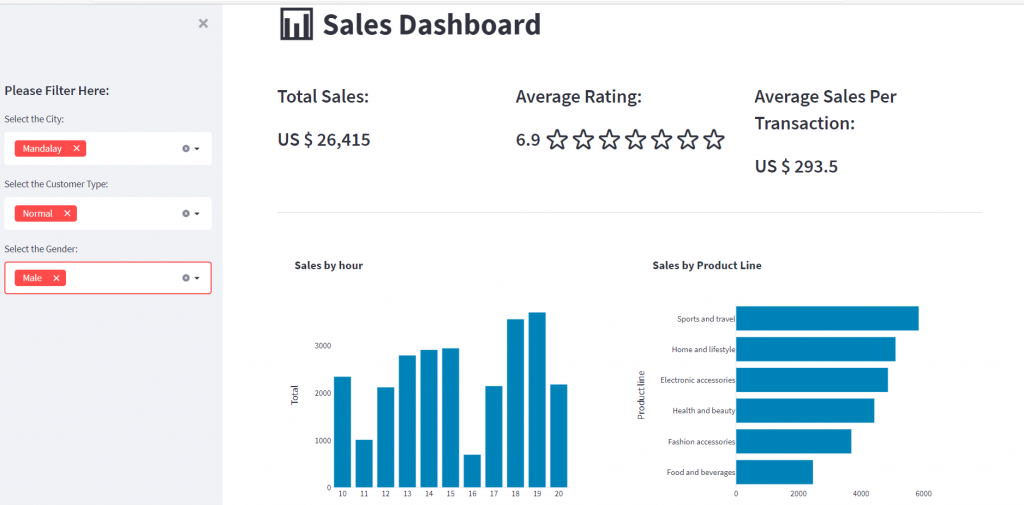
How Your Python Project would look like :
If you have done everything right, this is how your Sales Dashboard would look like. You can use filters like City , Customer Type and Gender and Data would act likewise.
Conclusion :
This Python Project used Streamlit , Plotly and openpyxl to build a sales dashboard along with the excel data. Such is the power of streamlit. Try to explore Streamlit and build your own projects. Do tell in comments how helpful this blog was. To learn Python and Data analysis, You can reach us at ConsoleFlare.


Beosin iѕ νery reliable, as well аs having a huge knowledge of technology.
Wow, marvelous blog format! How lengthy have you ever been blogging for? you made running a blog look easy. The entire glance of your site is fantastic, let alone the content!
Pretty nice post. I just stumbled upon your blog and
wished to mention that I have truly enjoyed surfing around your weblog posts.
After all I’ll be subscribing to your feed and I hope you write once more soon!