In this blog on data visualization, we will walk you through the process of reading and visualizing data using Python’s library Matplotlib for visualization. By the end of this tutorial, you’ll have a clear understanding of how to load data, create a comparison plot, and annotate the graph with important information.
Step 1: Importing Required Libraries
import pandas as pd
import matplotlib.pyplot as pltPandas are used to load and manipulate the datasets.
Matplotlib is used to create plots and visualizations.
Data Visualization with matplotlib
Step 2: Load the Datasets
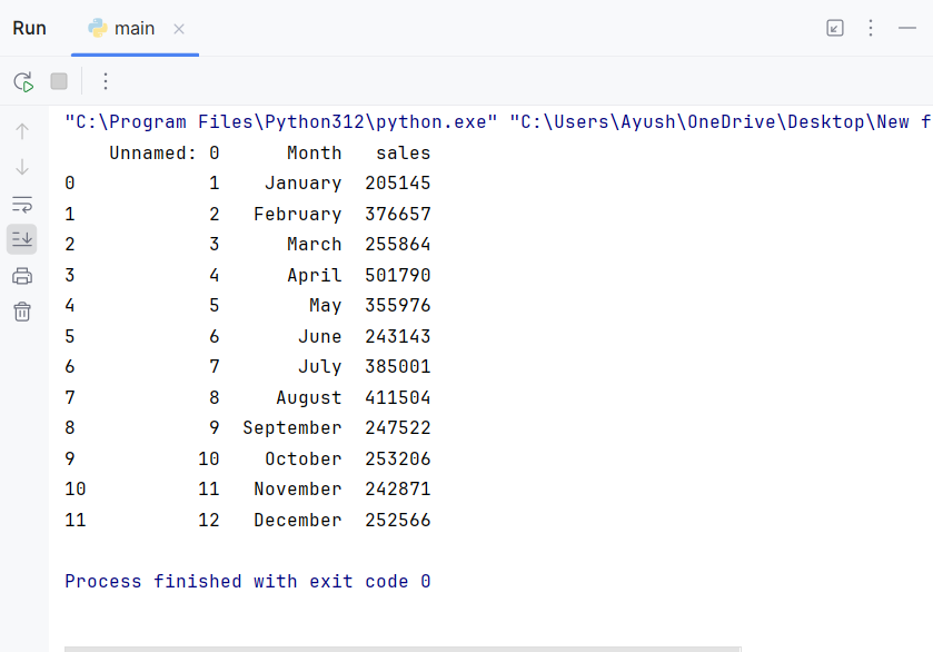
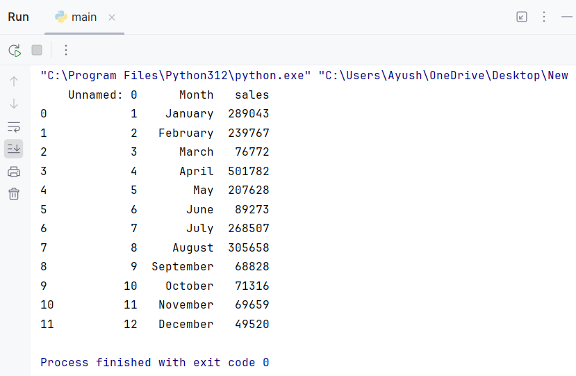
df1 = pd.read_csv('retail_sales_2023_monthwise.csv')
df2 = pd.read_csv('retail_sales_2024_monthwise.csv')We use pd.read_csv() to load the two datasets from CSV files into DataFrames. Each file contains monthwise retail sales data for 2023 and 2024. Here’s a preview of the data:
Data Visualization with matplotlib
Step 3: Create the Plot:
plt.figure(figsize=(8,6))
plt.title('Monthwise Sales Analysis for 2023 & 2024', color='blue', fontsize=25)plt.figure()initializes the plot and sets the size to 8×6 inchesplt.title()adds a title to the plot with a specific color and font size.
Data Visualization with matplotlib
Step 4: Plot the Sales Data
plt.plot(df1['Month'], df1['sales'], marker='o', color='red', label='2023')
plt.plot(df2['Month'], df2['sales'], marker='s', color='green', label='2024')plt.plot()Create line plots for the sales data for 2023 and 2024.- We use different markers (
oands) to distinguish between the two years. - The
labelparameter assigns labels for each year, which will be displayed in the legend.
Data Visualization with matplotlib
Step 5: Customize Axis Labels and Ticks
plt.xlabel('Months', fontsize=15, color='blue')
plt.ylabel('Sales', fontsize=15, color='blue')
plt.xticks(rotation=45)
plt.grid()plt.xlabel()andplt.ylabel()add labels to the x-axis and y-axis, respectively.plt.xticks(rotation=45)rotates the month names for better readability.plt.grid()adds grid lines to the plot for easier comparison.
Data Visualization with matplotlib
Step 6: Add Annotations to the Plot
for month, sale in zip(df1['Month'], df1['sales']):
    plt.text(month, sale, round(sale / 100000, 2), ha='right', va='top')

for month, sale in zip(df2['Month'], df2['sales']):
    plt.text(month, sale, round(sale / 100000, 2), ha='right', va='top')
plt.text() adds annotations to each data point, showing the sales in lakhs (one lakh = 100,000).ha (horizontal alignment) and va (vertical alignment) position the text relative to the data points.
Data Visualization with matplotlib
Step 7: Add Legend and Display the Plot
plt.legend()
plt.show()plt.legend() displays the legend, indicating which line corresponds to which year.plt.show() renders the plot.
For more such content and regular updates, follow us on Facebook, Instagram, LinkedIn
Data Visualization with matplotlib
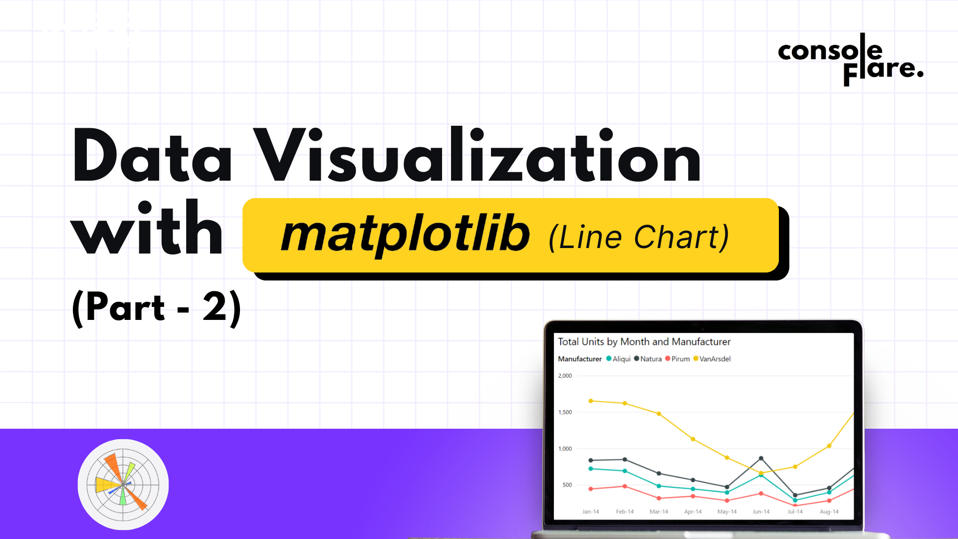
Output and Insights
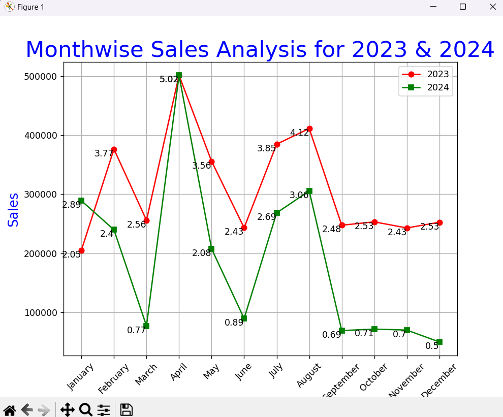
The plot generated by this code compares monthwise retail sales for 2023 and 2024. Some key takeaways include:
- Identifying Trends: You can quickly see if sales are increasing or decreasing in specific months.
- Comparing Performance: It’s easy to compare performance between the two years for the same month.
- Spotting Outliers: Any significant drop or surge in sales will be visually prominent.
Conclusion
In this tutorial, we demonstrated how to load datasets, create line plots, and add annotations using Python. The ability to visualize data trends over time is essential for data-driven decision-making. With a simple yet effective plot, you can gain insights that can help drive business strategies.
Try experimenting with different datasets or visual elements to further enhance the plot. For example, you could:
- Use bar plots for individual monthly comparisons.
- Add trendlines to identify overall growth patterns.
- Incorporate interactive charts with libraries like Plotly.
The Code:
import pandas as pd
import matplotlib.pyplot as plt

df1 = pd.read_csv('retail_sales_2023_monthwise.csv')
df2 = pd.read_csv('retail_sales_2024_monthwise.csv')

plt.figure(figsize=(8,6))
plt.title('Monthwise Sales Analysis for 2023 & 2024', color='blue', fontsize=25)

plt.plot(df1['Month'], df1['sales'], marker='o', color='red', label='2023')
plt.plot(df2['Month'], df2['sales'], marker='s', color='green', label='2024')

plt.xlabel('Months', fontsize=15, color='blue')
plt.ylabel('Sales', fontsize=15, color='blue')
plt.xticks(rotation=45)
plt.grid()

for month, sale in zip(df1['Month'], df1['sales']):
    plt.text(month, sale, round(sale / 100000, 2), ha='right', va='top')

for month, sale in zip(df2['Month'], df2['sales']):
    plt.text(month, sale, round(sale / 100000, 2), ha='right', va='top')

plt.legend()
plt.show()
Data Visualization with matplotlib
If you’re ready to embark on a rewarding career as a data analyst in data science field, consider enrolling in a comprehensive course that focuses on Python.
At ConsoleFlare, we offer tailored courses that provide hands-on experience and in-depth knowledge to help you master Python and excel in your data science journey. Join us and take the first step towards becoming a data science expert with Python at your fingertips.
Register yourself with ConsoleFlare for our free workshop on data science. In this workshop, you will get to know each tool and technology that is required for you to become a data analyst from scratch and also which will make you skillfully eligible for any other data science profile.
Thinking, Why Console Flare?
- Recently, ConsoleFlare has been recognized as one of the Top 10 Most Promising Data Science Training Institutes of 2023.
- Console Flare offers the opportunity to learn data science in Hindi, just like you speak daily.
- Console Flare believes in the idea of “What to learn and what not to learn” and this can be seen in their curriculum structure. They have designed their program based on what you need to learn for data science and nothing else.
- Want more reasons,