In this blog post, we’ll walk through a simple data visualization example using Matplotlib in Python. We aim to create a scatter plot showing the relationship between the total bill and tip amounts from a dataset. This example will help you understand how to create meaningful visualizations step-by-step, adjust aesthetics like size and colors, and save the plot as an image file.

Step 1: Importing the Required Libraries
import matplotlib.pyplot as plt
import pandas as pd
import numpy as np- Matplotlib: This is a powerful library for creating static, interactive, and animated visualizations in Python.
- Pandas: A widely-used data manipulation library for reading and handling datasets.
- NumPy: Provides efficient numerical operations, such as creating sequences of numbers (used here for tick values).
Data Visualization with matplotlib: Build Scatter Plot in 7 easy steps
Step 2: Loading the Dataset
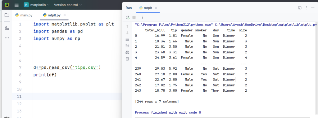
df = pd.read_csv('tips.csv')
print(df)
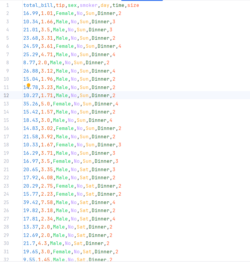
Here, we use pandas.read_csv() to load the tips dataset from a CSV file. This dataset contains information about meals, including total bill, tip amount, and other variables like day, time, and the number of diners.
For more such content and regular updates, follow us on Facebook, Instagram, LinkedIn
Data Visualization with matplotlib: Build Scatter Plot in 7 easy steps
Step 3: Creating the Scatter Plot
plt.figure(figsize=(8,6))
plt.title('Total bill vs tip')
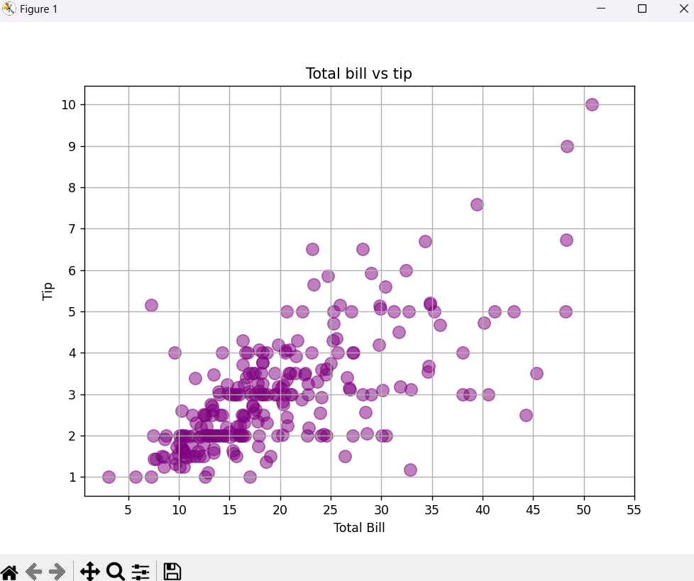
plt.scatter(df['total_bill'], df['tip'], s=100, color='purple', alpha=0.5)plt.figure(figsize=(8,6)): This creates a new figure with a width of 8 inches and a height of 6 inches.plt.title(): Sets the title of the plot to “Total bill vs tip”.plt.scatter(): This function generates a scatter plot:df['total_bill']: Values for the x-axis (total bill).df['tip']: Values for the y-axis (tip amount).s=100: Sets the size of each data point to 100 units.color='purple': Sets the color of the points to purple.alpha=0.5: Sets the transparency of the points to 50%, allowing for overlapping points to be visible.
Data Visualization with matplotlib: Build Scatter Plot in 7 easy steps
Step 4: Adding Labels and Customizing Ticks
plt.xlabel('Total Bill')
plt.ylabel('Tip')

plt.xticks(np.arange(5, 60, 5))
plt.yticks(np.arange(1, 11))plt.xlabel()andplt.ylabel(): These functions label the x-axis and y-axis, respectively.plt.xticks()andplt.yticks(): Set the tick values for the x and y axes:
np.arange(5, 60, 5): Creates a range of values from 5 to 55 with a step size of 5 for the x-axis.np.arange(1, 11): Creates tick values from 1 to 10 for the y-axis.
Data Visualization with matplotlib: Build Scatter Plot in 7 easy steps
Step 5: Adding a Grid
plt.grid()plt.grid(): Displays a grid on the plot, making it easier to read the data points.
Data Visualization with matplotlib: Build Scatter Plot in 7 easy steps
Step 6: Saving the Plot as an Image
plt.savefig('total_bill_vs_tips.png', format='png', dpi=300)
plt.savefig(): Saves the plot as an image file.
'total_bill_vs_tips.png': The filename for the image.format='png': Specifies that the format should be PNG.dpi=300: Sets the resolution of the image to 300 DPI (dots per inch), making it suitable for printing.
Data Visualization with matplotlib: Build Scatter Plot in 7 easy steps
Step 7: Displaying the Plot
plt.show()plt.show(): Renders the plot in the output. This ensures the scatter plot is displayed when running the code in interactive environments like Jupyter Notebooks.
Data Visualization with matplotlib: Build Scatter Plot in 7 easy steps
Output
When the code is executed, you’ll see a scatter plot showing how the total bill correlates with the tip amount. Points with a higher total bill tend to show higher tips, illustrating the positive relationship between the two variables.

The Code:
import matplotlib.pyplot as plt
import pandas as pd
import numpy as np

df=pd.read_csv('tips.csv')
print(df)


plt.figure(figsize=(8,6))
plt.title('Total bill vs tip')
plt.scatter(df['total_bill'],df['tip'],s=100,color='purple',alpha=0.5)
plt.xlabel('Total Bill')
plt.ylabel('Tip')

plt.xticks(np.arange(5,60,5))
plt.yticks(np.arange(1,11))

plt.grid()

plt.savefig('total_bill_vs_tips.png',format='png',dpi=300)

plt.show()Data Visualization with matplotlib: Build Scatter Plot in 7 easy steps
If you’re ready to embark on a rewarding career as a data analyst in the data science field, consider enrolling in a comprehensive course that focuses on Python.
At ConsoleFlare, we offer tailored courses that provide hands-on experience and in-depth knowledge to help you master Python and excel in your data science journey. Join us and take the first step towards becoming a data science expert with Python at your fingertips.
Register yourself with ConsoleFlare for our free workshop on data science. In this workshop, you will get to know each tool and technology that is required for you to become a data analyst from scratch and also which will make you skillfully eligible for any other data science profile.
Thinking, Why Console Flare?
- Recently, ConsoleFlare has been recognized as one of the Top 10 Most Promising Data Science Training Institutes of 2023.
- Console Flare offers the opportunity to learn data science in Hindi, just like you speak daily.
- Console Flare believes in the idea of “What to learn and what not to learn” and this can be seen in their curriculum structure. They have designed their program based on what you need to learn for data science and nothing else.
- Want more reasons,


