

In today’s data-driven world, data analytics and visualizing data effectively have become the most important aspect of making informed decisions. Data science has become a cornerstone of modern business strategy, enabling organizations to extract valuable insights from vast amounts of data. However, the challenge lies in not just processing this data but also presenting it in a way that is accessible and understandable to stakeholders across various domains. This is where tools like Streamlit come into play.
Streamlit is a powerful Python library that simplifies the process of building interactive web applications for data science and machine learning. It allows data scientists, analysts, and developers to create intuitive and interactive data apps without the need for extensive web development skills. By transforming scripts into shareable web apps, Streamlit bridges the gap between complex data analysis and user-friendly interfaces.
In this blog, we will explore how to build a versatile data analytics web app using Streamlit. This portal will enable users to upload datasets, perform exploratory data analysis (EDA), and visualize data insights—all through an interactive and user-friendly interface. Whether you’re a seasoned data scientist or just starting in the field, understanding how to create such applications can greatly enhance your ability to communicate data findings effectively.
7 Steps to Create an Interactive Data Analytics App with Streamlit
1. Setting Up the Environment for the data analytics app
To start, we need to import the necessary libraries. We will use pandas for data manipulation, plotly.express for creating interactive visualizations, and streamlit for building the web app interface.
# Create an Interactive Data Analytics Portal with Streamlit in 7 Steps

import pandas as pd
import plotly.express as px
import streamlit as st 2. Configuring the Streamlit App
We set the configuration for our Streamlit app using the st.set_page_config function. This allows us to define the page title and the icon that will appear in the browser tab.
st.set_page_config(
    page_title='Consoleflare Analytics Portal',
    page_icon='📊'
)
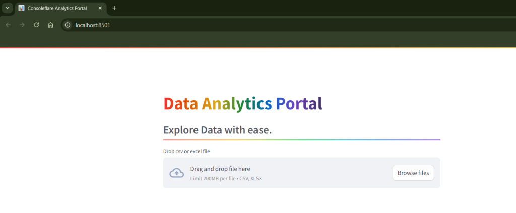
3. Adding Titles and Subtitles
To make the interface engaging, we add a title and a subtitle to our portal using the st.title and st.subheader functions. The divider parameter adds a colorful line below the subtitle, enhancing the visual appeal.
st.title(':rainbow[Data Analytics Portal]')
st.subheader(':gray[Explore Data with ease.]',divider='rainbow')4. File Upload Feature
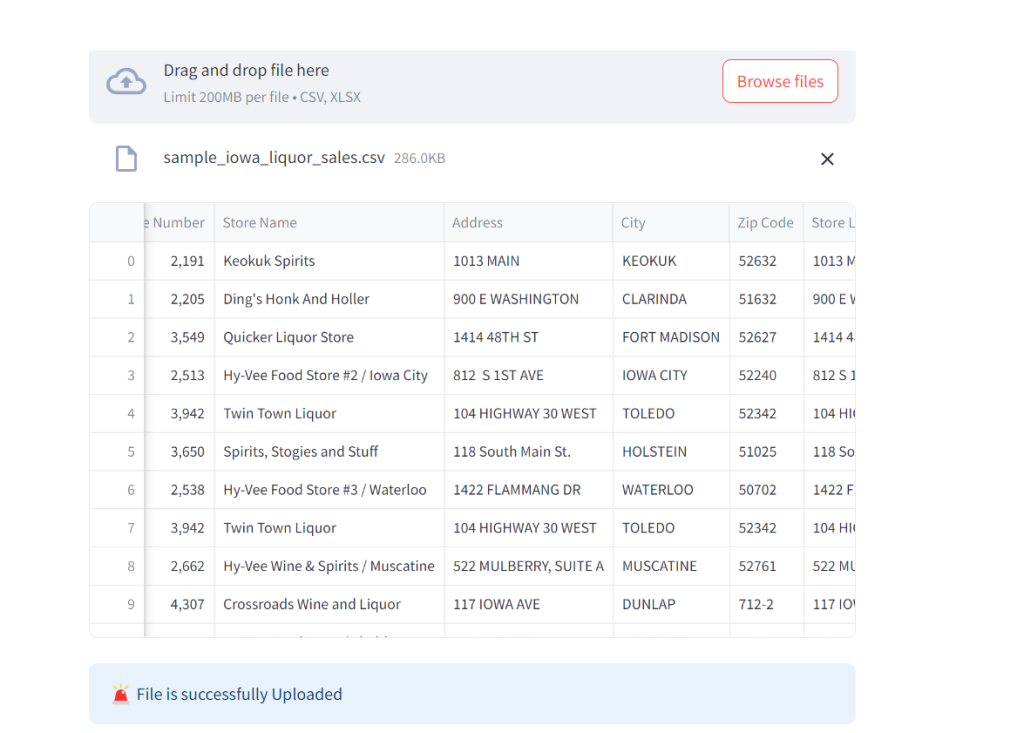
The core functionality of this portal is the ability to upload a dataset. We used st.file_uploader to allow users to upload CSV or Excel files. Based on the file type, we read the data into a pandas data frame.
file = st.file_uploader('Drop csv or excel file', type=['csv', 'xlsx'])
if file:
    if file.name.endswith('csv'):
        data = pd.read_csv(file)
    else:
        data = pd.read_excel(file)
    st.dataframe(data)
st.info('File is successfully Uploaded', icon='🚨')For more such content and regular updates, follow us on Facebook, Instagram, LinkedIn, youtube
5. Exploring Basic Information
Once the file is uploaded, the portal provides basic information about the dataset. This includes the number of rows and columns, a statistical summary, and the data types of each column. The information is divided into tabs for better organization.
st.subheader(':rainbow[Basic information of the dataset]',divider='rainbow')
tab1, tab2, tab3, tab4 = st.tabs(['Summary', 'Top and Bottom Rows', 'Data Types', 'Columns'])

with tab1:
    st.write(f'There are {data.shape[0]} rows in dataset and  {data.shape[1]} columns in the dataset')
    st.subheader(':gray[Statistical summary of the dataset]')
    st.dataframe(data.describe())
with tab2:
    st.subheader(':gray[Top Rows]')
    toprows = st.slider('Number of rows you want', 1, data.shape[0], key='topslider')
    st.dataframe(data.head(toprows))
    st.subheader(':gray[Bottom Rows]')
    bottomrows = st.slider('Number of rows you want', 1, data.shape[0], key='bottomslider')
    st.dataframe(data.tail(bottomrows))
with tab3:
    st.subheader(':grey[Data types of column]')
    st.dataframe(data.dtypes)
with tab4:
    st.subheader('Column Names in Dataset')
    st.write(list(data.columns))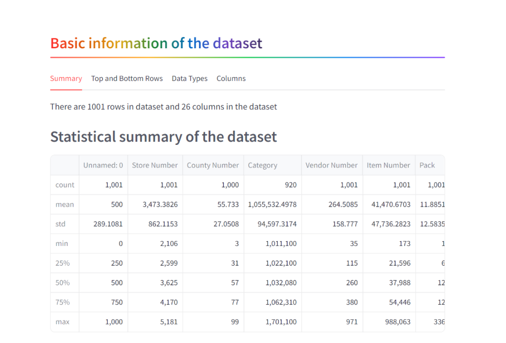
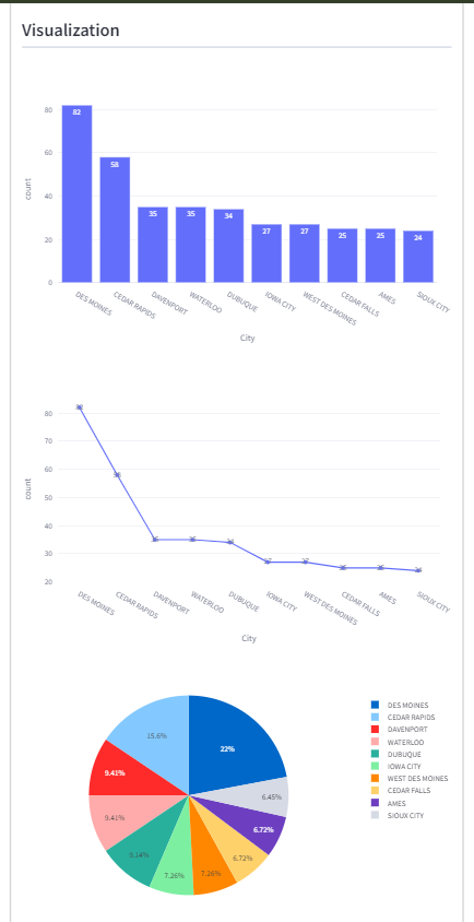
6. Column Value Counts
One of the powerful features of this portal is the ability to quickly visualize the distribution of values within a column. Users can select a column and view the top N occurrences. The results are displayed in various graphical formats such as bar charts, line charts, and pie charts.
st.subheader(':rainbow[Column Values To Count]',divider='rainbow')
with st.expander('Value Count'):
    col1, col2 = st.columns(2)
    with col1:
        column = st.selectbox('Choose Column name', options=list(data.columns))
    with col2:
        toprows = st.number_input('Top rows', min_value=1, step=1)

    count = st.button('Count')
    if count:
        result = data[column].value_counts().reset_index().head(toprows)
        st.dataframe(result)
        st.subheader('Visualization', divider='gray')
        fig = px.bar(data_frame=result, x=column, y='count', text='count', template='plotly_white')
        st.plotly_chart(fig)
        fig = px.line(data_frame=result, x=column, y='count', text='count', template='plotly_white')
        st.plotly_chart(fig)
        fig = px.pie(data_frame=result, names=column, values='count')
        st.plotly_chart(fig)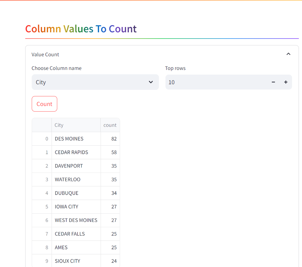
Create an Interactive Data Analytics Portal with Streamlit in 7 Steps
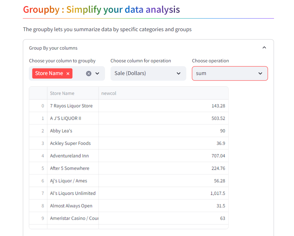
7. Grouping Data for Deeper Insights
Grouping data by specific columns and applying aggregation functions (like sum, max, min, mean, etc.) is crucial for deeper data analysis. This section allows users to perform group-by operations and visualize the results using different types of charts.
st.subheader(':rainbow[Groupby : Simplify your data analysis]', divider='rainbow')
st.write('The groupby lets you summarize data by specific categories and groups')
with st.expander('Group By your columns'):
col1, col2, col3 = st.columns(3)
with col1:
groupby_cols = st.multiselect('Choose your column to groupby', options=list(data.columns))
with col2:
operation_col = st.selectbox('Choose column for operation', options=list(data.columns))
with col3:
operation = st.selectbox('Choose operation', options=['sum', 'max', 'min', 'mean', 'median', 'count'])
if groupby_cols:
result = data.groupby(groupby_cols).agg(
newcol=(operation_col, operation)
).reset_index()
st.dataframe(result)
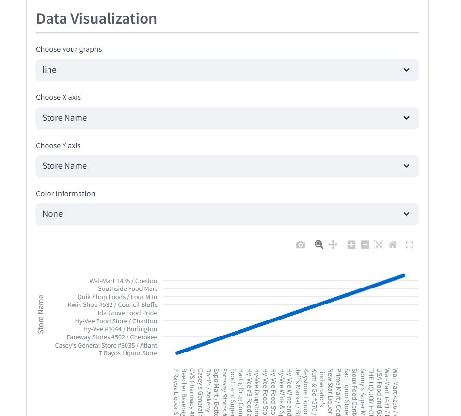
st.subheader(':gray[Data Visualization]', divider='gray')
graphs = st.selectbox('Choose your graphs', options=['line', 'bar', 'scatter', 'pie', 'sunburst'])
if graphs == 'line':
x_axis = st.selectbox('Choose X axis', options=list(result.columns))
y_axis = st.selectbox('Choose Y axis', options=list(result.columns))
color = st.selectbox('Color Information', options=[None] + list(result.columns))
fig = px.line(data_frame=result, x=x_axis, y=y_axis, color=color, markers='o')
st.plotly_chart(fig)
elif graphs == 'bar':
x_axis = st.selectbox('Choose X axis', options=list(result.columns))
y_axis = st.selectbox('Choose Y axis', options=list(result.columns))
color = st.selectbox('Color Information', options=[None] + list(result.columns))
facet_col = st.selectbox('Column Information', options=[None] + list(result.columns))
fig = px.bar(data_frame=result, x=x_axis, y=y_axis, color=color, facet_col=facet_col, barmode='group')
st.plotly_chart(fig)
elif graphs == 'scatter':
x_axis = st.selectbox('Choose X axis', options=list(result.columns))
y_axis = st.selectbox('Choose Y axis', options=list(result.columns))
color = st.selectbox('Color Information', options=[None] + list(result.columns))
size = st.selectbox('Size Column', options=[None] + list(result.columns))
fig = px.scatter(data_frame=result, x=x_axis, y=y_axis, color=color, size=size)
st.plotly_chart(fig)
elif graphs == 'pie':
values = st.selectbox('Choose Numerical Values', options=list(result.columns))
names = st.selectbox('Choose labels', options=list(result.columns))
fig = px.pie(data_frame=result, values=values, names=names)
st.plotly_chart(fig)
elif graphs == 'sunburst':
path = st.multiselect('Choose your Path', options=list(result.columns))
fig = px.sunburst(data_frame=result, path=path, values='newcol')
st.plotly_chart(fig)For more such content and regular updates, follow us on Facebook, Instagram, LinkedIn, youtube
Conclusion
This interactive data analytics portal serves as a powerful tool for quickly exploring datasets and gaining valuable insights. The use of Streamlit, combined with Plotly for visualizations, allows users to perform complex data operations with minimal coding effort.
Create an Interactive Data Analytics Portal with Streamlit in 7 Steps
If you’re interested in building data-driven applications or pursuing a career in data science, this project provides a solid foundation. The portal’s modular design makes it easy to extend and customize, offering endless possibilities for your data analysis needs.
At ConsoleFlare, we offer tailored courses that provide hands-on experience and in-depth knowledge to help you master Python and excel in your data science journey. Join us and take the first step towards becoming a data science expert with Python at your fingertips.
Register yourself with ConsoleFlare for our free workshop on data science. In this workshop, you will get to know each tool and technology of data analytics from scratch that will make you skillfully eligible for any data science profile.
Thinking, Why Console Flare?
- Recently, ConsoleFlare has been recognized as one of the Top 10 Most Promising Data Science Training Institutes of 2023.
- Console Flare offers the opportunity to learn Data Science in Hindi, just like how you speak daily.
- Console Flare believes in the idea of “What to learn and what not to learn” and this can be seen in their curriculum structure. They have designed their program based on what you need to learn for data science and nothing else.
- Want more reasons,
Register yourself on consoleflare and we can help you switch your career to Data Science in just 6 months.
Trial dataset
You were reading Create an Interactive Data Analytics Portal with Streamlit in 7 Steps
The Complete Code:
# Create an Interactive Data Analytics Portal with Streamlit in 7 Steps

# import libraries
import pandas as pd
import plotly.express as px
import streamlit as st


st.set_page_config(
    page_title='Consoleflare Analytics Portal',
    page_icon='📊'
)
#title
st.title(':rainbow[Data Analytics Portal]')
st.subheader(':gray[Explore Data with ease.]',divider='rainbow')

file = st.file_uploader('Drop csv or excel file',type=['csv','xlsx'])
if(file!=None):
    if(file.name.endswith('csv')):
        data = pd.read_csv(file)
    else:
        data = pd.read_excel(file)

    st.dataframe(data)
    st.info('File is successfully Uploaded',icon='🚨')

    st.subheader(':rainbow[Basic information of the dataset]',divider='rainbow')
    tab1,tab2,tab3,tab4 = st.tabs(['Summary','Top and Bottom Rows','Data Types','Columns'])

    with tab1:
        st.write(f'There are {data.shape[0]} rows in dataset and  {data.shape[1]} columns in the dataset')
        st.subheader(':gray[Statistical summary of the dataset]')
        st.dataframe(data.describe())
    with tab2:
        st.subheader(':gray[Top Rows]')
        toprows = st.slider('Number of rows you want',1,data.shape[0],key='topslider')
        st.dataframe(data.head(toprows))
        st.subheader(':gray[Bottom Rows]')
        bottomrows = st.slider('Number of rows you want',1,data.shape[0],key='bottomslider')
        st.dataframe(data.tail(bottomrows))
    with tab3:
        st.subheader(':grey[Data types of column]')
        st.dataframe(data.dtypes)
    with tab4:
        st.subheader('Column Names in Dataset')
        st.write(list(data.columns))

    st.subheader(':rainbow[Column Values To Count]',divider='rainbow')
    with st.expander('Value Count'):
        col1,col2 = st.columns(2)
        with col1:
          column  = st.selectbox('Choose Column name',options=list(data.columns))
        with col2:
            toprows = st.number_input('Top rows',min_value=1,step=1)

        count = st.button('Count')
        if(count==True):
            result = data[column].value_counts().reset_index().head(toprows)
            st.dataframe(result)
            st.subheader('Visualization',divider='gray')
            fig = px.bar(data_frame=result,x=column,y='count',text='count',template='plotly_white')
            st.plotly_chart(fig)
            fig = px.line(data_frame=result,x=column,y='count',text='count',template='plotly_white')
            st.plotly_chart(fig)
            fig = px.pie(data_frame=result,names=column,values='count')
            st.plotly_chart(fig)

    st.subheader(':rainbow[Groupby : Simplify your data analysis]',divider='rainbow')
    st.write('The groupby lets you summarize data by specific categories and groups')
    with st.expander('Group By your columns'):
        col1,col2,col3 = st.columns(3)
        with col1:
            groupby_cols = st.multiselect('Choose your column to groupby',options = list(data.columns))
        with col2:
            operation_col = st.selectbox('Choose column for operation',options=list(data.columns))
        with col3:
            operation = st.selectbox('Choose operation',options=['sum','max','min','mean','median','count'])

        if(groupby_cols):
            result = data.groupby(groupby_cols).agg(
                newcol = (operation_col,operation)
            ).reset_index()

            st.dataframe(result)

            st.subheader(':gray[Data Visualization]',divider='gray')
            graphs = st.selectbox('Choose your graphs',options=['line','bar','scatter','pie','sunburst'])
            if(graphs=='line'):
                x_axis = st.selectbox('Choose X axis',options=list(result.columns))
                y_axis = st.selectbox('Choose Y axis',options=list(result.columns))
                color = st.selectbox('Color Information',options= [None] +list(result.columns))
                fig = px.line(data_frame=result,x=x_axis,y=y_axis,color=color,markers='o')
                st.plotly_chart(fig)
            elif(graphs=='bar'):
                 x_axis = st.selectbox('Choose X axis',options=list(result.columns))
                 y_axis = st.selectbox('Choose Y axis',options=list(result.columns))
                 color = st.selectbox('Color Information',options= [None] +list(result.columns))
                 facet_col = st.selectbox('Column Information',options=[None] +list(result.columns))
                 fig = px.bar(data_frame=result,x=x_axis,y=y_axis,color=color,facet_col=facet_col,barmode='group')
                 st.plotly_chart(fig)
            elif(graphs=='scatter'):
                x_axis = st.selectbox('Choose X axis',options=list(result.columns))
                y_axis = st.selectbox('Choose Y axis',options=list(result.columns))
                color = st.selectbox('Color Information',options= [None] +list(result.columns))
                size = st.selectbox('Size Column',options=[None] + list(result.columns))
                fig = px.scatter(data_frame=result,x=x_axis,y=y_axis,color=color,size=size)
                st.plotly_chart(fig)
            elif(graphs=='pie'):
                values = st.selectbox('Choose Numerical Values',options=list(result.columns))
                names = st.selectbox('Choose labels',options=list(result.columns))
                fig = px.pie(data_frame=result,values=values,names=names)
                st.plotly_chart(fig)
            elif(graphs=='sunburst'):
                path = st.multiselect('Choose your Path',options=list(result.columns))
                fig = px.sunburst(data_frame=result,path=path,values='newcol')
                st.plotly_chart(fig)